We made it! I didn’t know how much I would be able to accomplish in the past week, since I broke my toe last week, but it’s finished!
I redecorated this bathroom on a budget and have been blogging about it as part of the One Room Challenge. You can find the previous posts here: Week One, Week Two, Week Three, Week Four, Week Five/Six, and Week 7. Special thanks to Linda from One Room Challenge for putting this together and the media sponsor Better Homes and Gardens.

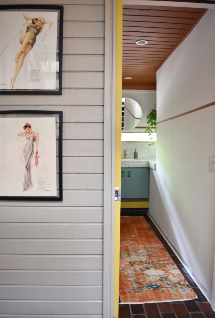
I am absolutely obsessed with these rugs. They are so beautiful and work well together. I don’t like things to be too matchy matchy, and I think they work to define the separate entry area and bathroom.
As you may recall, I contemplated switching up the Varga prints, but I actually grew to love them even more with the addition of the new rugs and the colors in the bathroom. I plan to repaint this entry space next.
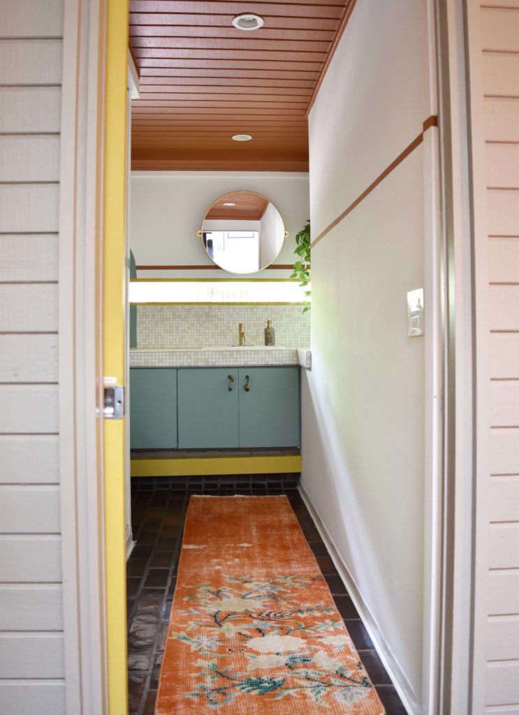
My goals for the bathroom were to highlight the architecture of the room, add color, and do it on a budget with minimal trips to the stores. The total came out to less than $1000 and I used a lot of what I already had.
Here’s the cost breakdown with links to the items: Faucet ($260), Mirror ($225), Rugs ($190), Paint ($100), Towel Ring ($63), Cabinet Pulls ($20), Misc ($75).
As I have mentioned in previous posts, the wall mural was inspired by @banyanbridges on Instagram. She paints colorful murals and this room was screaming for something on the walls. I wanted to incorporate a mural into the entire space, and bring it all together, but I also didn’t’ want it to become too busy. I think I succeeded! My husband Dave said that this is his favorite room that I’ve ever designed.
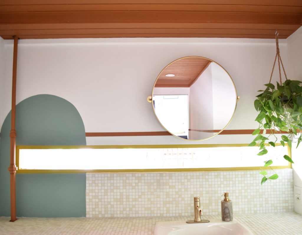
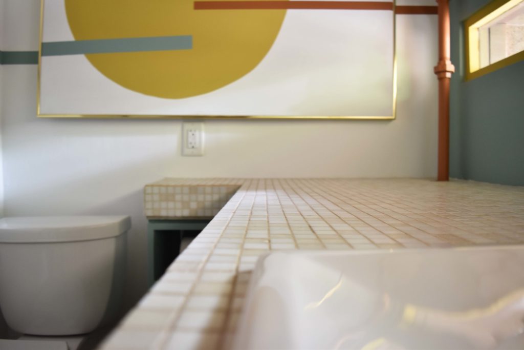
I knew that I had to do something to make that missing tile spot look intentional, so I added a color block with a rounded top to mimic the lines of mirror. I also painted the gas pipe the same color as the ceiling. I contemplated covering it with something and then painting that, but with COVID it’s just too annoying to go anywhere that’s not necessary.
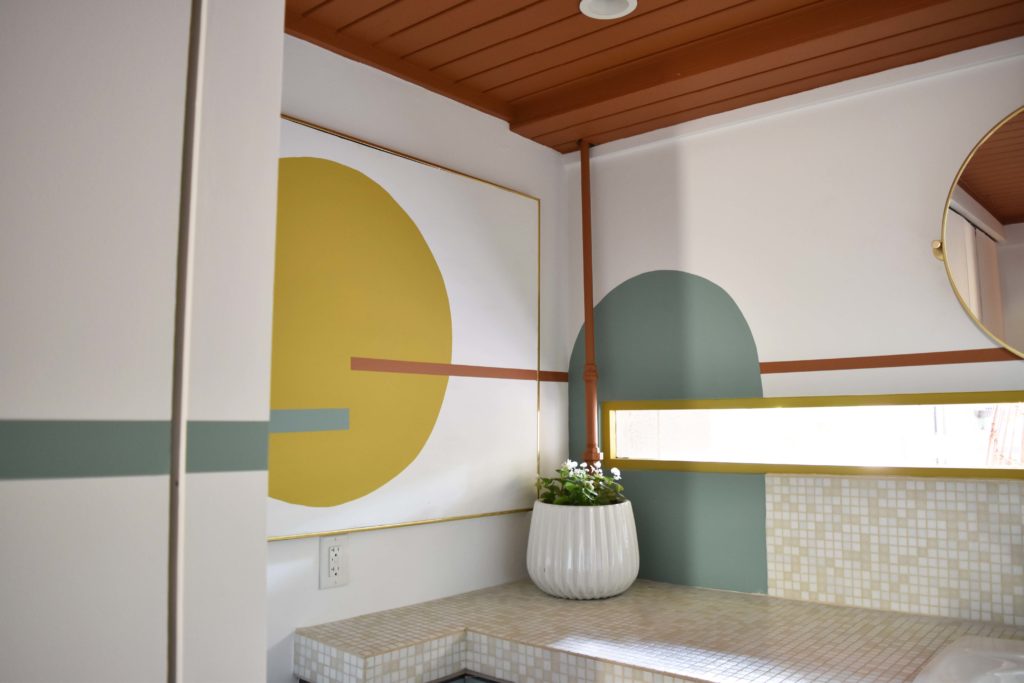
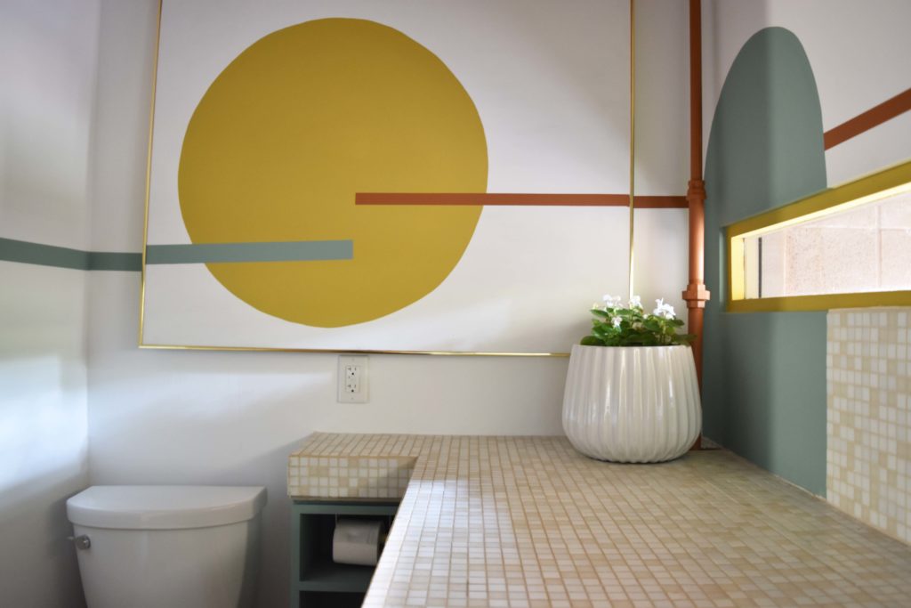
The mural’s focal point is the canvas. The lines start here and then extend around the whole room. I knew where I wanted the lines to go, so I started them on the canvas and then extended the lines around the room. I’ll do a separate blog post about how to get crisp lines. If you follow me on Instagram, you saw lots of stories about this.
The cabinet pulls I got at an Estate Sale at Maximalist Studios from Eddie Ross. They fit this room absolutely perfectly and the holes even lined up so I didn’t have to drill new ones! A fun fact is that one year ago this week Eddie Ross was at our house styling a photo shoot for BHG. I hope it someday makes it to the pages of BHG! The suspense is killing me.

The pocket door I painted years ago. I still liked the color (Alchemy from Sherwin-Williams), so it was incorporated into the color palette.

Let’s take a short trip back memory lane to see what this space used to look like. I’m very into sustainable design. A lot of times you can keep and re imagine what you already have, instead of ripping it all out and starting over. I was lucky and able to save a lot of money on this space by keeping what I liked: flooring, sink, cabinet, and counter tops. In the future, I want to make that large closet a shower, but that will be much more than $1000 🙂 I’m saving my money for that project.
The biggest change to the space was removing the upper cabinet that housed a gas meter. As luck would have it, the gas company came out to move the meter outside about a month before we tackled this project. We still have a pipe running vertically through this space, but it looks a million times better.

I wanted something large to cover the electrical panel. A thrift store find canvas that I already had was the perfect size for this space. I just painted over it and incorporated the design into the whole room.

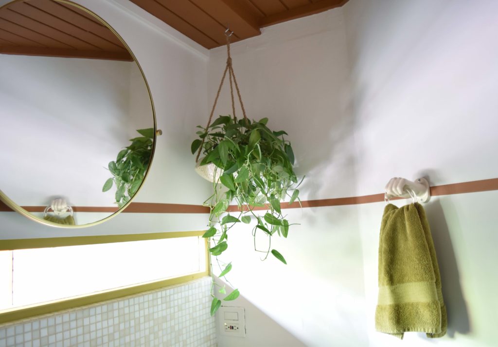
I also already had that hanging planter and plant. The plant I stole from my craft room, so now I have to replace it!
I couldn’t just buy any old towel ring, so I found this one on Etsy. I really love fun design elements like this, and it’s handmade in the US, so that’s awesome too.


I would really love to hear your thoughts on this room. What to you love about it? I LOVE it all!
Be sure to check out the One Room Challenge Blog, which links to everyone’s blog posts. You will be SO inspired by what you see. I love interior design and it’s so fun to see all of the creativity.

*Brandi


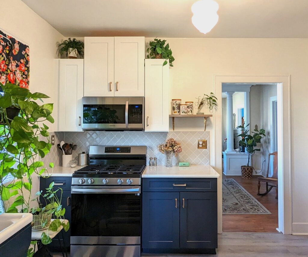
I love it all too! I especially love the hand towel holder. Fits perfectly with your amazingly unique home. Congrats for getting it done, and I hope your toe doing ok!
Thank you so much! I love that towel holder as well. It was between this and a vintage chunky wooden one that I would have painted. But I liked the unexpected hand in this one. My toe is feeling ok, I just walk really weird. Haha.
Looks so great! I love how fun it is, great Job!
Thanks so much. That is what it feels like, fun!
how fun!! love the pops of bright colors and the graphic elements … great color blocking to link the wall to the tile backsplash and i love how the lines just run throughout the room!
Thanks so much! I hoped to solve a lot of the design dilemmas with the mural and I think it worked.
I love the eclectic vibe, you did a great job!
Thank you very much! I am really happy with it.
Well done! It looks so cool and that mural!
Thanks so much!
Really fun, I love how you used the paint to solve the cabinet hole and integrate the pipe into the mural – so clever!!!
I stared at the walls for a very long time to figure it all out. Haha.
I didn’t even notice the missing tile – well done with the arch! I love the retro (but not overbearingly so) feel — it’s beachy and light.
Thanks so much! It really doesn’t stand out anymore, which was my goal. Yay.
Very clever design. Well done.
Thank you Brenda! I am so happy with how it turned out.