This time we will take a look at the bedroom and bathroom in the back of the house. If this is the first post you are reading in the Morrison Series, here is a quick recap. I compare the house as it was when the original owner and his family lived here. He was also the architect, Robert Morrison, and it was built in 1963. You can find part one (living room) here, part two (master bedroom) here, and part three (kitchen) here and part four (dining room) here.
In order to give you some perspective on where we are in this tour, I wanted to show you a drawing of the house. I have been showing you the upper level (and I am currently redoing the bathroom on the lower level, which you can read about here).
The houses was actually built in two stages. The first stage was the living room, kitchen, bathroom upstairs and downstairs and the master bedroom (which was was actually two bedrooms.) Phase two of the plan was some of the portions in yellow below (combining the two bedrooms into one, adding the dining/multipurpose room and two bedrooms and a shared bath.)


The two rooms in the back are mirror images of each other. They each have a sink and in between them is a bathroom with a shared tub and toilet.
There used to be a glass curved window across the whole back (above each sink and the tub) which looked incredible! When we bought the house it had been replaced with high clerestory windows instead.

These spaces can be used as bedrooms or offices or anything really. When we had our master bedroom in the front, we used one side as a guest bedroom and the other side as my craft room. Then we moved our bedroom to one side and use the other side as a dressing room. Unfortunately it’s a hot mess, so you will only get to see the bedroom side today.

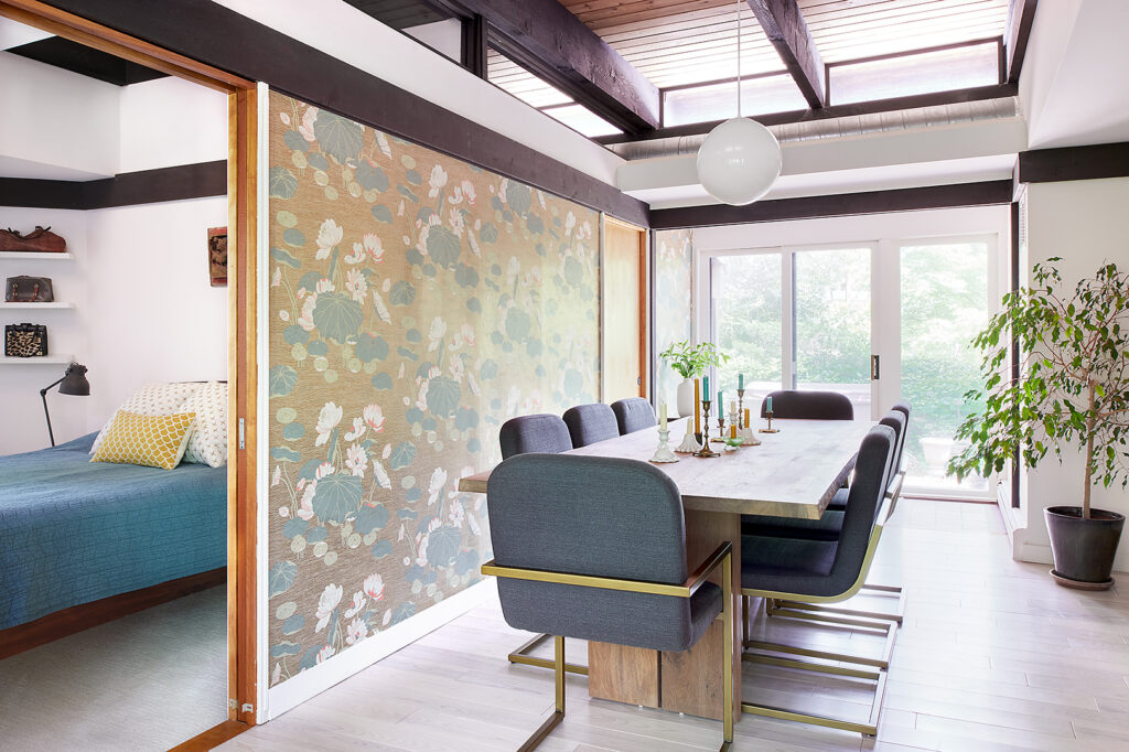
The bedroom is off of the dining room. You can read all about what we did to this room in this blog post. I have changed some things around since then.
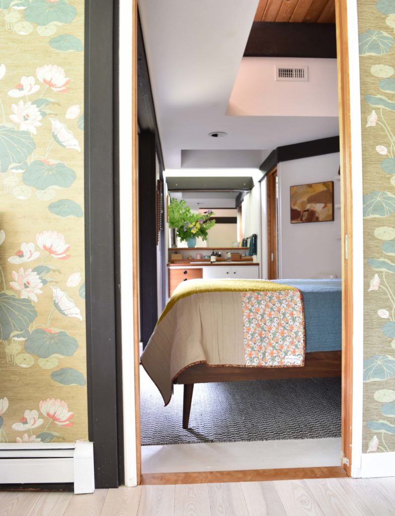
Initially I had plants on the shelves, but they weren’t getting enough sun so I moved them to an area with more light. I decided to display my purses on them.

The art is an antique mall find (oh how I miss shopping for vintage). The chair was from the Clover Market, the bed is Article, the bedside tables and square pillows are HomeGoods finds, the round pillow and lady art are an Estate Sale finds, and the lamp is IKEA. The quilt at the end of the bed is for sale in my shop. Don’t worry, we don’t actually use it; it was just used to style this room!

The sink area we kept the same, and only painted the cabinets and got new knobs. I made that huge flower arrangement from plants in the yard. I used bleeding hearts, solomon’s seal, purple iris, hellebore leaves, and two plants that I’m not sure of the name.
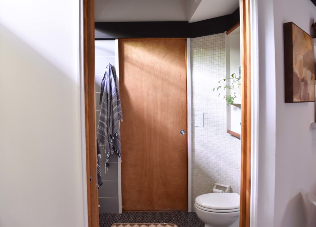
We had this bathroom remodeled a few years ago. We wanted to save costs, so the right side of the room we left as is (except a new toilet). And the left side and floor are new.
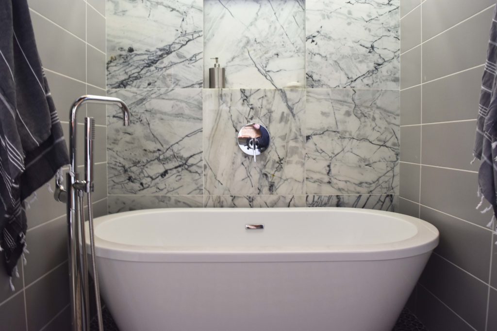
I wanted to mimic the look of a full slab wall, at a fraction of the cost, so we used large 24″ square marble tiles.
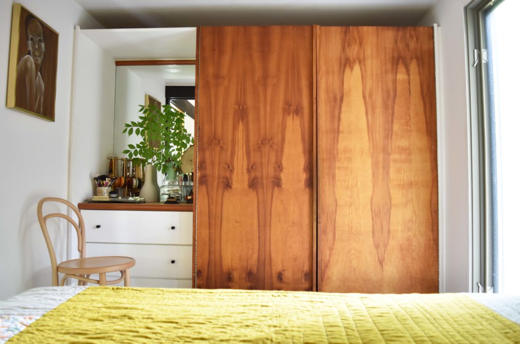
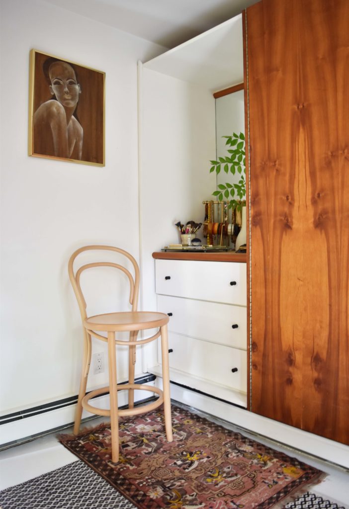
We painted the build in cabinets and added new knobs. Those wooden closet doors are original. Aren’t they beautiful? The windows in this room are really unusual. You can see it on the drawing above, they jut into the room 90 degrees. Since they are at an angle you really can’t see into the house, but you can see out, which is cool. We can lay in bed and watch the wildlife outside this window. The foxes especially like to torment our dog Winnie.

The hanging lamp is an estate sale find, as is the art above the bed. I plan to reframe it one day into a smaller frame in a different color. I just remembered I have a whole blog post about it here.
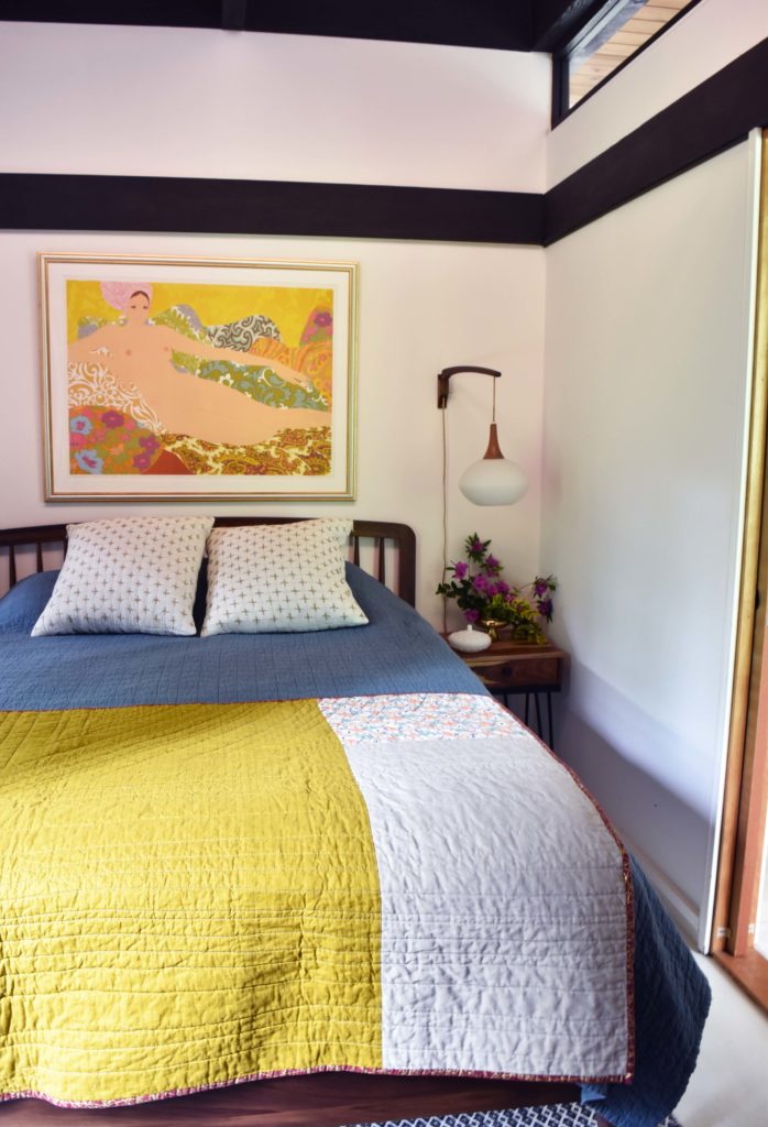
I love those windows at the top to let in light from the dining room. This room is dark, so it’s hard to photograph and I hope I did it justice. One day perhaps a professional will photograph this room.
The design of this area really is so versatile. We like having our bedroom tucked back here, because it’s nice and quiet. Plus Dave can get ready in the other room without waking me up. When school is in session he wakes up at like 5am. Yikes.
Let me know what you think!
*Brandi


0 Comments